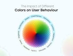
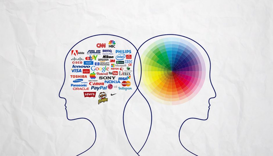
In the fast-evolving world of web design, one fundamental concept comes across as relating to the user experience and brand image the most: color. Psychology-based colors decide how individuals react towards the web site or how the brands are perceived. This article explains why color psychology is an extremely significant part of web design along with how different colors can elicit varied responses in users and also different behaviors.
Color Psychology: Learning What Color Makes a Difference
Color psychology will be explained as the practice that involves the way that colors influence human behaviors, emotions, and decision-making. Colors can cause feelings, shape perceptions, and even motivate actions. Color Psychology in Web Design, the right color scheme improves user experience, may clear brand recognition, and lead to higher conversion rates.
Effects of Colours on User Behavior
A different color can evoke a different response or influence the behavior of the user on a website in a qualitative manner. Here are some of the common colors found in websites and their associated meanings:
Red
Is generally perceived to create an effect of excitement, passion, and urgency. It has the power to stimulate hunger and give customers a thrilling experience. This is why it is a popular color for call to actions, such as “Order Now” or “Limited Time Offer.” Many food delivery services use the color red, thus encouraging users to place an order immediately. Apart from this, red can easily grab one’s attention, which is why it is ideal for any sale notifications or limited offers. Researchers claim that red also increases users’ heart rates. It does this by giving the person an intense excitement feeling.
Blue
Also Represented with trust, security and professionalism. The color blue is widely used on corporate websites and financial institutions because this color has the ability to increase confidence among users. PayPal along with Facebook utilized blue in order to offer a sense of reliability. Researchers discovered that light blue can slow down the pulse rate and provide a sense of relaxation. Therefore, businesses that want to make their users feel less anxious will opt for this color. The other good feature of blue is that it fosters the sense of loyalty, which is very important for brands wanting to hold onto their customers.
Green
This color is thought to represent growth, harmony, and freshness. Green is also often used for the branding of companies known to be eco-friendly and health-related businesses. For instance, Whole Foods company employs green in order to prove a care for the environment. At the same time, it can evoke peace in people, which makes it a pretty good color for health, wellness, and lifestyle brands. Green is also the symbol of money and riches in many cases, that is why most banks use it in their brand images.
Yellow
It is a color of optimism, energy, and joy. Yellow is a bright colour with great cheerfulness. Still, it must be used in a very moderate style. If there is too much yellow, it can become overwhelming. Brands such as McDonald’s apply yellow, which gives a sense of happiness and warmth. Yellow should be balanced by other colors so that it is not tiring and does better for its positive features. Yellow also attracts impulsive buyers because this color stimulates the mental processes.
Black
This is one color that symbolizes elegance, sophistication, and authority. Black is applied to most luxurious brands as it will give the feel of exclusiveness. Most the websites with Chanel and Gucci use black backgrounds to create their product luxurious in appearance. Black is likely to combine bright colors and capture people’s attention in the main elements of a page. Black can also be effective in creating an illusion of a greater value for the product. This is the reason black is considered to be the best color for luxury brands.
Purple
It represents creativity as well as richness coupled with spirituality. With a tinge of sophistication, this color, therefore, gains acceptance among brands that dare to venture into the mystery and creativity it embodies. Brands like Yahoo and T-Mobile use it for distinguishing themselves and, in the long run, establishing their identity. This has to do with wisdom, as well as imagination making it the favorite among educational and artistic channels.
Color Preferences: The Science Behind
Understanding the reasons why some users react towards certain colors is an integral part of effective web design. There are so many reasons that can explain why people like one color more than another:
Cultural Context
For a given culture, the color connotes something entirely different from what it would mean in another culture. White is the color of purity for the West but that for mourning in some Eastern cultures. For design needs when targeting a global market, cultural sensitivities and what colors connote should be very much understood. Companies aiming at different markets should research to know if their chosen color speaks well to cultures.
Personal experiences
also determine the use of color from a different perspective. A single positive experience with a brand using a particular color could lead to future favoritism of the same color in different situations. Discovering the demographics of your target audience will reveal their colour inclination. Users through surveys and feedback can give you great insight into how they actually feel about the colors you have chosen for your website.
Trends and Fashion
Nowadays, the changes in society as well as fashion, technology, or pop culture can influence color trends. Keeping yourself up to speed with current design trends will bring you up to the same level with your audience’s tastes. Take inspiration from industry trends, and stay active in design forums.
Practical Examples of Colour Psychology in Web Design
E-commerce Sites
Many online retailers use colors sensibly to brighten up the buying experience. Amazon uses a combination of both blue, orange, and white hues to prompt people into checking out their products and making their purchases. Orange buttons can be used to instill urgency, and the call for action will occur there. Brands like ASOS are also implementing more brash uses of colors to point out sales, draw attention, and increase conversion rates.
Non-Profit Organizations
Most not-for-profit websites utilize green and blue colors that indicate hope and trust. Environmentally focused charities use various tones of green to portray that it is a for-sustainable growth philosophy. For instance, the panda logo of WWF is used with the touch of the green color scheme, signifying conservation. And appealing on an emotional level to the users.
Tech Companies
Companies like Apple and Microsoft use a clean, bare approach, keeping the entire background in white, accompanied by shades of gray and blue. Innovativeness, clarity, and professionalism are represented by this color scheme. Even the ‘white space’ used by Apple, with hints of gray and silver, makes the theme look modern and sleek enough to appeal to any techie.
Personal Blogs
Lifestyle bloggers will use warm colors such as peach or coral to provide warmth and a welcoming atmosphere. This invokes a sense of belonging that gets the visitors involved. Blogs that are soft and pastel,. Such as Cupcakes and Cashmere, are meant for a warm approachable environment. In most cases, the choice of color impacts how readers perceive the personality of the blog.
Financial Institutions
Banks and financial services are usually conveyed through shades of blue and green,. In order to convey the message of trust and stability. For instance, JPMorgan Chase has almost consistently used blue to create feelings of confidence regarding their financial services, backed by white to convey clarity and professionalism. The green appears on brands like Visa to convey growth and dependability, which assures clients of the security of their money.
Strengthful Colour Palette
So, when you’re actually making the website, remember that it’s not about colors individually but how they harmonize with one another; here are some tips for effective color schemes:
Limit Your Palette
In order not to saturate your eyes with a clutter of colors, use 2-3 main colors and 1-2 accent ones. A limited range of colors may be the difference between setting up a dominant brand and not. Neutral-colored backgrounds allow for better visibility of your primary colors.
Consider color contrast
There is a need to provide enough contrast in the colors between the texts and the background for readability. High contrast improves user experience and accessibility. Color contrast test can be used by using the tool from WebAIM,. This indicates that ensuring a right contrast within the accessibility standards is of great importance, especially to users with visual impairments.
Use Inspiration Tools
Many online tools, such as Adobe Color and Coolors, allow you to build color palettes that work well with each other. Most of these applications have existing palettes. But can be used to customize a palette around a desired brand identity. Digging into color schemes employed in your industry may also inspire some ideas.
Test and Iterate
Run A/B testing on color schemes that have piqued your interest. Don’t be too trusting of ideas from the end-users. In some cases, user feedback will prove to be the most illuminating for you on colors. Assesses metrics like click through rate, to discover which color works best with CTAs.
Consider the Emotional Impact
Think about the emotions you want to evoke through your website. Align your color choices with your brand values and the messages that you want to engage on your website. For example, if you want to create a form of excitement, red or orange would be vibrant enough. On the other hand, if you aim to create a sense of calmness and reliability, you’d be all good about blues and greens.
Colour Psychology in Branding
Color psychology extends beyond web design as well and plays a role in branding. A consistent color scheme throughout all marketing channels helps to solidify brand recognition as well, making it easily recognizable to the consumer. Consider these extra factors as well:
- Logo Design: Your logo will most often be the first thing that user views; make sure your logo’s colors add up to your overall brand messaging and values. Most recognized brands were made with this ability to be recognized in a jiffy,. Even by their color scheme alone.
- Marketing Collaterals: Business cards, social media posts. And other marketing materials should all feature the same colors that are used on your website to support branding identity. This can create a huge bonding experience in the overall branding experience.
Packaging: If a business sells products, the color of their packaging can be incredibly important to how consumers perceive those products.
Conclusion
In simple words, color psychology gives web design a highly vital role, as it gets the user behaving appropriately and molds the perception of the brand to the targeted audience. If you know how a certain color evokes specific emotions and behaviors, then you would be able to make a truly effective website that not just becomes a piece of eye candy for users but improves user experiences and fosters desirable behavior. And as you embark on your journey with web design, remember that every color counts. Experience the magic of color psychology and create that website for the audience, but engaging them in the right amount to enhance the brand identity.
Call to Action
If you’re looking to upgrade your web design strategy and tap into the power of color psychology to really enhance user engagement and brand perception, then Hostao is the ideal host for you. Our professional team can help develop a stunningly designed and effective website that tailors to your own brand’s unique identity and goals. Contact us today!
As a master's graduate in Computer Science, I blend my technical expertise with a passion for crafting content that simplifies complex topics. My focus is on creating clear, engaging material that resonates with a diverse audience. By staying current with trends in SEO, social media, and content strategy, I aim to produce content that not only educates but also connects, bridging the gap between technology and its users.


