Minimalist web design is the most effective approach to site creation that represents a superior user experience while aligning with business goals in the modern digital landscape. Minimalist design is not only simplicity but clarity, functionality, and elegance. It allows websites to concentrate on what’s really important, removing everything that’s not necessary, achieving better performance and a more incredible user journey. Clean and meaningful design is something we believe is always at the heart of these principles, so we confirm every website we build is performing at its best for our customers.
A Short History of Minimalist Design
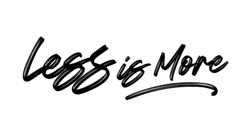
In fact, a minimalist aesthetic movement started in the 20th century, deeply rooted in art, architecture, and interior design as a reaction against the elaborate ornateness of styles such as Art Nouveau and decoration overload prevalent in the previous decades. Artists and designers, such as Ludwig Mies van der Rohe, coined the phrase “less is more,” inspired by the idea of purifying a design back to its essence.
The minimalist movement in web design gained speed during the early 2000s, in tandem with changing user needs and rising mobile technology penetration. The growing unruliness of websites blighted with heavy multimedia together with messy interfaces instilled a need for simpler, quicker, and more intuitive designs. These needs were addressed by minimalist design principles focusing on simplicity, speed, and clarity-in values that the people of Hostao adopt in building their websites.
Minimalist Design Principles and Meaning
Minimalist web design has a few ground principles aimed at ridding anything extraneous to concentrate usability and content delivery:
- Simplicity : The design should be oriented toward only what’s most important. Stripping back distractions and giving a clear, direct way through the site for users.
- Whitespace : Also called negative space, whitespace gives visual clarity and helps orient the user toward important information by allowing breathing room for design elements.
- Clarity and Functionality : Minimalist designs tend to make everything on the page worthwhile and meaningful. Therefore, every visual element should have a defined function.
- Typography : Clean and readable typography is the hallmark of minimalism design. Moreover, reading text should not be an issue, but it should add to the overall design aspect.
- Minimal Color Scheme: We use very few colors in minimalistic designs for the sake of visual overload. Neutral shades, monochromes, and subtle highlighting colors are used a lot.
- High-quality Images: Though the design is supposed to be simple, we pair high-quality images or icons with minimalist web design for an effective but non-overwhelming user experience.
At Hostao, we encapsulate these elements to design eye-catching web designing services that stress functionality without compromise on aesthetics.
Understanding “Less is More” Philosophy
The “less is more” philosophy first introduced in architecture by Mies van der Rohe has a deep application in web design. The core idea of the approach to focus on quality rather than on quantity is elimination of those elements which might undermine the basic functionality and usability of a website. In web designing, the concept of “less is more” means
- Emphasize clarity and simplicity.
- Eliminate unnecessary noise that could overwhelm the user.
- No element should appear to have no purpose whatsoever.
In the quest to eliminate clutter, it is not a surprise that minimalist sites often win when compared with more elaborate counterparts in terms of usability and speed. And the overall user experience.
Benefits of Minimalist Web Design
1. Load Time
One of the obvious benefits of minimalistic web design is that it loads faster. Websites with lots of animation, big images, and multimedia content have a long time to open, which frustrates users and deteriorates their rankings in search results. Minimal websites, no matter how simple or basic, should load really fast so that the user doesn’t leave before the webpage is fully loaded.
Hosting one’s minimalist website on Hostao, with a focus on performance in each design created, is important to know. Because faster websites translate to higher conversion rates. When for eCommerce and service-based businesses, this is an important feature.
2. Improved Focus and Usability
In a minimalist design, what’s allowed to float to the surface is those things that really matter-meaning, content, and actions. Thus, by reducing distractions to the minimum, a visitor is able to interact more meaningfully with elements on the page, whether that’s a product, service offering, or call to action.
Hostao implements minimalism to aid an organization in communicating its most essential matters. For instance, in the eCommerce scenario, minimalism will lead the user directly to the product they want. Hence raising the probabilities of making a conversion.
3. Better Responsiveness on Mobile
Minimalist designs, therefore, came out easily fit for small screens. In the present digital world today, mobile-first design is very vital since most people browse through the internet using their mobile phones or tablets. The removal of such unnecessary elements would leave minimalist designs ultra-responsive to scale content perfectly in any device.
Hostao is aware that a mobile-friendly website is no longer a luxury but a necessity. By applying the minimalistic approach, we, as professionals, help our clients create websites that have a perfect view on every device, which increases the usability and happiness of its users.
4. Content Focus
The hero in minimalist web design is content. Much visual clutter or too much design will divert attention away from any major messages, products, or services you want to focus on promoting. By placing the content right up front, minimalist design puts it right in front of the user so that they can easily swallow the information and then engage with it.
Hostao helps in letting the content on your website speak for itself with no burden of flourishes through design. The content is maximally center-staged using written copy, images, or videos. And this improves user engagements and subsequently leads to better business outcomes.
5. SEO and Conversion Rate Optimization
A minimalist web design will be characterised by clean, streamlined code, which the search engines love. A clean, fast-loading website is much easier for the search engines to crawl and index, which may yield better rankings. Minimalist design also improves user experience, meaning that it increases time spent on the site and reduces bounce rates-two factors that positively influence your website’s search rankings.
More than that, minimalist design puts the attention of the users on call-to-action buttons, forms, or product listings. This means that there is reduced distraction. Hence, there is a high chance of conversion, which is quite necessary to businesses that have a digital presence.
Minimalism and Long-term Appeal
Others become outdated simply because they are trendy and way too over-designed to accommodate a particular design preference. Minimalist designs, on the other hand, are based on simplicity and function, thus giving them a longer lifespan. Because minimalist websites rely on timeless design principles, they tend to persist for years without having to regularly undergo redesign.
We are minimalist websites builders at Hostao who defy time. This eventually means saving the clients money in the long term but confirming that every website will always be up-to-date, user-friendly, and easy to navigate.
Conclusion
Accordingly, it is more geared towards clarity, speed, and usability for the user. It can therefore be ideal for any business seeking to optimize their online presence. We’re big believers at Hostao in the philosophy “less is more”-we want every site we design to be not only beautiful but also functional and useful.
Whether you’re looking to sell more through your eCommerce site or communicate information, a minimal approach can make your users more engaging and have a better business result. Contact us today to learn how we can improve your online presence with the elegance of minimalism.
As a master's graduate in Computer Science, I blend my technical expertise with a passion for crafting content that simplifies complex topics. My focus is on creating clear, engaging material that resonates with a diverse audience. By staying current with trends in SEO, social media, and content strategy, I aim to produce content that not only educates but also connects, bridging the gap between technology and its users.


