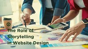
In today’s super competitive digital arena, having a functional website just isn’t enough. It needs to tell a pretty interesting story about the brand if it is ever going to captivate and convert its audience. Storytelling through web design really brings together design, content, and functionality in guiding a user through a narrative that will incorporate cognitive as well as emotional messages. At Hostao, we believe there’s a high need for intertwining brand stories with each and every thread of web design to engage users and have meaningful connections.
Here’s how you can approach good design elements to tell your brand story and lead your audience into an immersive experience.
1. Building a Visual Hierarchy That Guides the User’s Journey
A good story has a beginning, middle, and end. A website, ideally, should also guide the visitor from a journey. Visual hierarchy refers to the structure that directs the viewer’s eye and pushes the most important information up front while showing supporting details as step by step in the story. In this, it allows users to process information in a logical way, much as they would follow a sequence in a story.
At Hostao we will create visual hierarchies that guide them on a narrative storyline. Big headline style welcome, prominent image space, and calls-to-actions will capture the attention of users where desired. Along these lines, the users will not only understand the story behind the brand but also be encouraged to take an action such as sign up for a newsletter, explore services, or make some purchase.
Extended Technique:
- Use the rule of thirds when laying out the composition to break information pieces up into an arrangement that feels balanced yet visually interesting: The image would then produce a kind of visual flow that allows the audience to take information from it but doesn’t overwhelm them.
- Applying the golden ratio to the layout of elements brings beauty and an organic feel and interaction for people to connect with; just like a great story has rhythm, so should the design.
- Using Whitespace: Negative space is often underestimated yet definitely an effective tool that helps with focus. It lets important things be prominent and gives breathing room for readers to digest what’s happening in the narrative.
2. Using Imagery to Build Emotional Connections
Images are not only decor; images are actually a form of the very powerful storytelling tools which evoke emotion, create an atmosphere, and convey the values of your brand instantly. Excellent imagery enables visitors to build an emotive connection with your brand that is personally meaningful to them; it’ll engage the visitor further as well as make them trust your brand more.
Hostao stresses how one uses first-class brand images that add to a story-telling type of overall narrative. It could be in the form of a dynamic hero image, an engaging photo gallery, or the product shots which “emphasize” your offerings. The imagery applied to a website can say much before a single word is ever read.
Extended Technique:
- Story-Driven Video Content: Short video clips or animated fragments, carried over with static images, will better enhance the understanding. Videos can give an entire story in a minute, adding more context and depth to the information and enabling users to maintain sight on something longer.
- Sequential storytelling: Use slider carousels to tell a sequential story. Every image in the set should work as a build-up on the previous one, revealing new aspects of your brand or product narrative in an attractive manner.
- Background Imagery: Large background images or videos can faintly remind people of your brand’s story. Use the example of a traveling company and see how those sweeping landscapes or super busy cityscapes can really touch a chord of adventure and excitement.
3. Typography: Setting the Tone and Voice of Your Story
Typography isn’t just choosing that cute font; it’s the selection of a font that carries the right tone and assists in fortifying your brand message. The style, size, and color of your text would communicate professionalism, playfulness, luxury,. Or approachability shaping how users understand your content.
For Hostao, typography is aligned with the voice of the brand. It confirms that consistency and clarity are delivered throughout on all devices. All these are chosen based on careful consideration, not only because they are readable but also because of the tone that needs to be delivered by the message.
Extended Technique:
- Text as Design Element Large, bold text could be assembled as a graphic element that reminds an audience at a very good number of some key points. The impact of a quote or statistic on reinforcing a brand’s mission may result in an emotional pull on the user.
- Dynamic Typography: It includes animations or hover effects that add movement and interactivity to typography and bring engagement. For example, when you place your cursor on a CTA button, the font size or color changes a little for a sense of some action.
- Multi-Level Typography: Heads, subheadings, and body texts in different sizes and weights help develop layers for your story. It gives a visual interest that organizes content in an interesting form.
4. Colors: Design Mood and Ambiance
Colors can have a fantastic psychological impact on the way people perceive your brand. Mood and ambiance colors are designed for different emotions, from serenity and trust to excitement and urgency. When it comes to designing colors for web pages, they should be chosen carefully in order to uplift the mood of the brand story or what would cause the desired feeling in the user.
At Hostao, we design a color scheme according to the client’s brand vision and in a manner that would wrap up coherently with an interactive engagement for users. We confirm consistent choices that would draw a balance to most areas of the site, thus making key features such as call-to-actions stand out.
Extended Technique
- Color Symbolism: Be aware of colors and use them for your advantage. Use blue, for instance to give a feeling of trust and stability, while red gives excitement and urgency. Using a color that you need to match with the emotion you want to convey unto users makes your story stronger.
- Gradient Color Schemes: Gradients add an element of depth and movement to the design, as it will bring a more dynamic character with both aspects of progression and continuity. For example, a warm-cool gradient could be used to walk the user through different stages of your brand’s story – passion, serenity for example.
- Cultural Context: When marketing to a multicultural audience, one must be aware of how people in different cultures perceive color. Something positive in one culture is negative in another; use color according to your expectations of your audience.
5. Interactive Elements and Animations: Dynamic Storytelling
Animations and interactions lend the storyline of a brand some substance, give life to a website, permit movement forward, and facilitate interaction with the content on the site. Micro interactions could be hover effects, clickable icons,. Or scroll-triggered animations that softly nudge the user and make the overall narrative flow better.
At Hostao, we have animations that not only look good but actually mean something. Through motion, we strategically bring the user journey to a new level of understanding and memory, engaging users.
Extended Technique:
- Interactivity and Scrolling: Add parallax scrolling to your story, whereby the background images scroll at a different speed than the foreground content – making it look like a live, 3D storytelling experience. This dynamic technique might help your brand story seem that much more engaging, as it happens as if you are driving in layers with your users.
- Triggered Animations: Unveiling different parts of a story through scroll-triggered animations as users scroll along the site. The case is where a product’s key feature unfolds one by one as you scroll down the page, putting suspense in the minds of viewers and making them click more.
- Interactive Story Maps: Think about interactive maps or timelines where the user can peruse different angles on the story of your brand. It might be the history of your company timeline or a map of the global reach of your services, with each point providing additional context as users click or scroll.
6. The Role of Content: Weaving the Story
Design element shines the spot and sets the tone, but without content, there can never be a ‘story’ of the brand. Clear, concise, and engaging content enables the users to understand the mission and values of your brand and what you are offering. In all content, whether it’s the main headline or detailed blog posts, there should be a purpose to advance the story.
Hostao makes sure that the copy on your website accompanies its visual story. It is based on our approach toward aligning content with design so the user gets a single, cohesive message. That way, we use storytelling techniques like empathy, and a sense of relatability. And aspiration to make the content more interesting.
Extended Technique:
- Interactive content storytelling: allows the user to drive the flow of narrative. For example, using the choose your adventure format for descriptions of a product, allowing a user to pick and discover specially designed feature or benefits information.
- Narrative-Driven Blogs: Rather than these blog posts, think of a blog as merely a long chapter of the story of your brand. Take advantage of the blog to go deeper into stories about the journey of the brand, case studies. Or stories of customer success and add depth in the sense of authenticity and trust.
- Conversational Copywriting: Write in content that is conversational so it creates an intimate feel between the brand and its users. Personalizing content for different user personas will make the narrative more relevant and relatable.
7. Mobile-First Design: Design Consistency Across Devices
Since more users are coming in via mobile devices, confirming that your brand’s story is the same across devices falls on a top agenda. Therefore, with a mobile-first design approach,. You can confirm your website’s narrative is reachable and exciting to all regardless of what device the user is using.
At Hostao, our designs are responsive, confirming the story will go as fluidly from the PC to whichever device it may be accessed on. We’d be lax on mobile usability but not at the expense of visual impact,. So we wouldn’t sacrifice flow on the desktop for a lesser flow on the handheld devices.
Extended Technique:
Mobile-Friendly Interactions: Design gesture-friendly interaction interfaces. They would enable users to engage with the story by tapping, swiping, or pinching it. Micro-interactions for mobile add depth and make the experience appear more intimate.
- Mobile Optimized Content: Simplify your content on a mobile. On a mobile, there is much less room to play with than on a desktop computer,. So a producer needs to simplify the flow of content to confirm the user focuses on the most important aspects of the story.Examples of this are accordions and collapsible sections that hide secondary information in order to let the user focus on the main narrative.
Conclusion
Forbes magazine labels the storytelling in web design to be more than just eye candy. It is about weaving an emotional bond with your audience, moving them through meaningful action on the basis of your brand’s story. Hostao thus, keeping a focus on visual hierarchy, typography, color, animations. And content, enables businesses to build stories that captivate users and turn them into faithful customers.
Each piece that goes into restructuring or building a new website should be an outstanding player in the grand narrative. At Hostao, we believe every website can tell a great story-one that moves users and makes them leave a memorable mark.
As a master's graduate in Computer Science, I blend my technical expertise with a passion for crafting content that simplifies complex topics. My focus is on creating clear, engaging material that resonates with a diverse audience. By staying current with trends in SEO, social media, and content strategy, I aim to produce content that not only educates but also connects, bridging the gap between technology and its users.


